Movie Poster Analysis
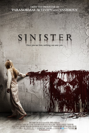
Sinister have made a very effective poster which conforms with the typical horror film poster. This is because they use a colour scheme which include black, white and red. These are colours that are associated with horror as they represent danger, death and the unknown. The title is slightly faded and blends into the background and this makes it really effective for the audience to look at as it potentially represents the running of blood which could easily be linked to death. In the poster, blood runs down the wall and you can see the markings of a face. This could potentially be a hidden message to the audience and gives them an insight into what is to come in the film. They stated at the top of the poster that the producer of the film was the producer of 'Paranormal Activity' and 'Insidious'. These two films were very successful and popular and this would encourage the audience to see the film. They have also put their social media links at the bottom of the poster which would encourage people to find their pages and follow them meaning they get a bigger audience.
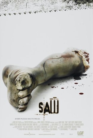
The saw poster does not conform with the typical horror film poster. They have used a black and white effect which creates tension but also gives it a clean/clear thought of intention and mysterious which gives it a gruesome feeling about the film because . This poster links with the theme of the movie and that victim's body parts have been sawed off.
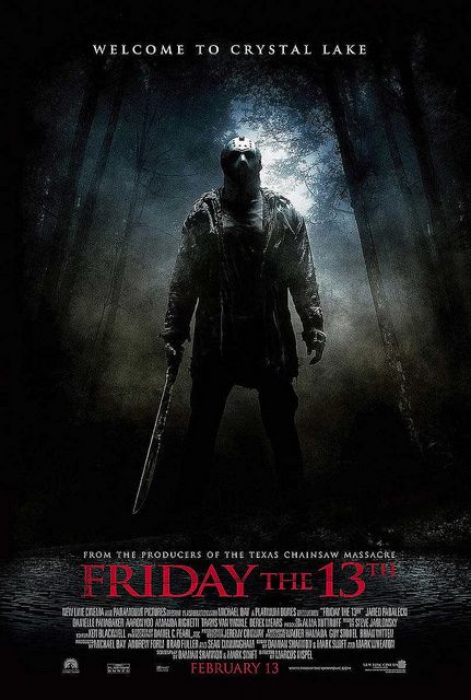
The friday the 13th poster uses colours such as red, white and black, these colours are typically used to represent blood, horror. The use of the darkness creates an eary effect and that fact that Jason is slowly revealed form the darkness creates a scary effect. The use of the colour red represents blood and gore which are linked to the horror genre.
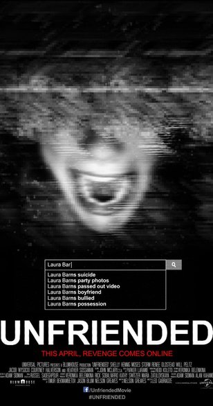
The unfriended poster follows horror conventions by using dark colours and a dark theme for the fonts and pictures, this creates the effect that the film is trying to portray.
